Pick a direction. Walk there.
Pick a category and Afoot points to the nearest matching place. There is no feed or review list. I designed and built the app, then submitted it to the App Store.
Pick a category and Afoot points to the nearest matching place. There is no feed or review list. I designed and built the app, then submitted it to the App Store.
Pick a category and Afoot points to the nearest matching place. There is no feed or review list. I designed and built the app, then submitted it to the App Store.
Most place-discovery apps are feeds. You scroll, compare reviews, and lose ten minutes choosing a coffee shop. Afoot assumes the best place is one you can walk to now, and the decision should take three taps.
I designed and built this one solo, concept to App Store. Product thesis, UX, the SwiftUI app, the MapKit integration, the test suite, the icon. The screens below are the live app logic rebuilt for the web.
The visual system went through four directions before it landed. Early mockups chased soft signal worlds and frosted glass, with radial glows and Inter set in a friendly register. They were attractive and wrong. A precision compass that nudges you out the door should not feel like a wellness app.
Afoot is a native SwiftUI app for iPhone on iOS 18 and later. I submitted it to the App Store as a one-time purchase with no account or in-app purchases. The code separates location, session state, place search and caching, compass math, and the SwiftUI views.
Most place-discovery apps are feeds. You scroll, compare reviews, and lose ten minutes choosing a coffee shop. Afoot assumes the best place is one you can walk to now, and the decision should take three taps.
A compass makes that decision feel final. Once the needle locks, you go. Afoot has no list, map, or reviews. You pick coffee, food, bars, or random, then follow the arrow. The input screen is plain mono text because it only has one job. Tap a category and the search starts.
I designed and built this one solo, concept to App Store. Product thesis, UX, the SwiftUI app, the MapKit integration, the test suite, the icon. The screens below are the live app logic rebuilt for the web.
02 / Category picker
Editorial accordion
Design decisions
Accordion, not tabs
Categories and subcategories in one list. No second screen, no navigation stack.
Editorial list
Rows are plain text, no icons, no thumbnails. Fast to scan, nothing decorative to maintain.
Commit on select
Tapping a subcategory locks and navigates. No confirm button.
The visual system went through four directions before it landed. Early mockups chased soft signal worlds and frosted glass, with radial glows and Inter set in a friendly register. They were attractive and wrong. A precision compass that nudges you out the door should not feel like a wellness app.
The answer was to commit to a single hard idea: the Suunto MC-2 sighting compass. Flat monochrome, no gradients, no shadows, opacity as the only depth channel, JetBrains Mono throughout. The dial is not decoration. It is the entire UI, and it plays four roles from one set of parts. It is the splash mark, the idle face, the search loader, and the live compass. Gate, graduated bezel, lance needle, jewel hub. Drag the slider to turn the phone: the bezel rotates with you, the needle holds the destination, and the gate lights when you are pointed right.
03 / Compass face · MC-2 dial
Active compass
Design decisions
One instrument, four roles
The same dial is the splash mark, the idle face, the search loader, and the live compass. The bezel, gate, needle, and jewel hub are the entire visual language.
Drag to turn the phone
The slider simulates device heading. The bezel rotates with you while the needle holds the destination. Turn until the needle settles inside the gate and the gate lights.
Critically damped spring
On a new destination the needle swings from its old angle to the new one and never overshoots. The math lives in CompassMath, decaying toward the live bearing rather than a frozen target.
Hysteresis gate
A 10° / 14° enter-exit gate and a 0.5° bezel deadband suppress jitter, so alignment reads as a confident lock, not a flicker.
The MC-2 idea carries the live compass, main flow, settings sheets, and permission states. Each surface reuses the same dial, button ladder, mono lists, and instrument glyphs. The dial also becomes the splash mark and search loader. The copy and information architecture come straight from the SwiftUI views, so a category sheet and an arrival screen still feel like the same product.
The full system · core flow · sheets · system states
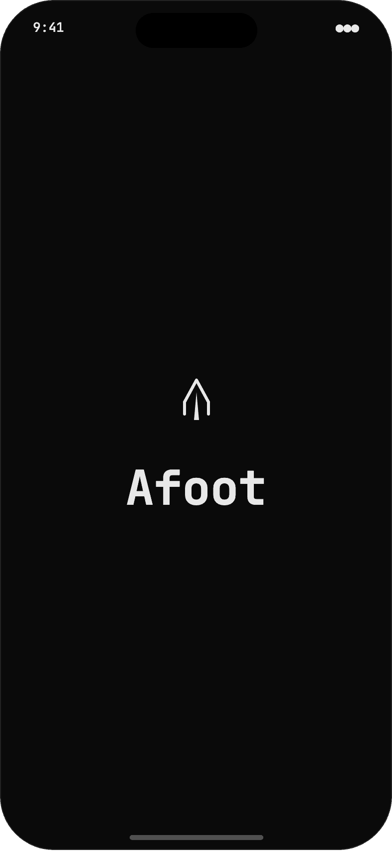
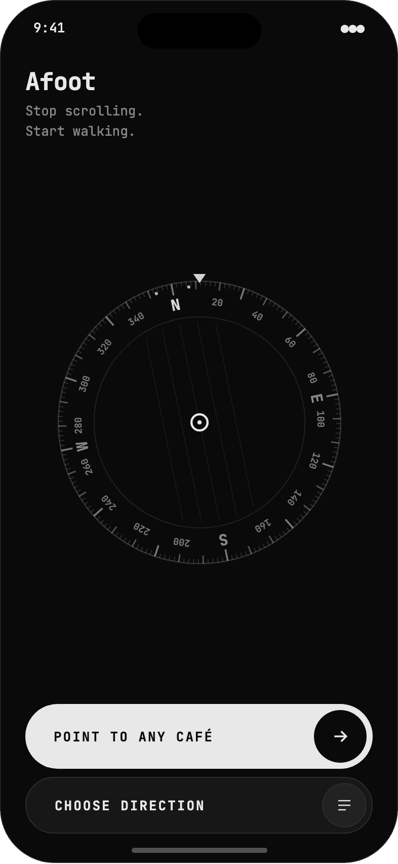
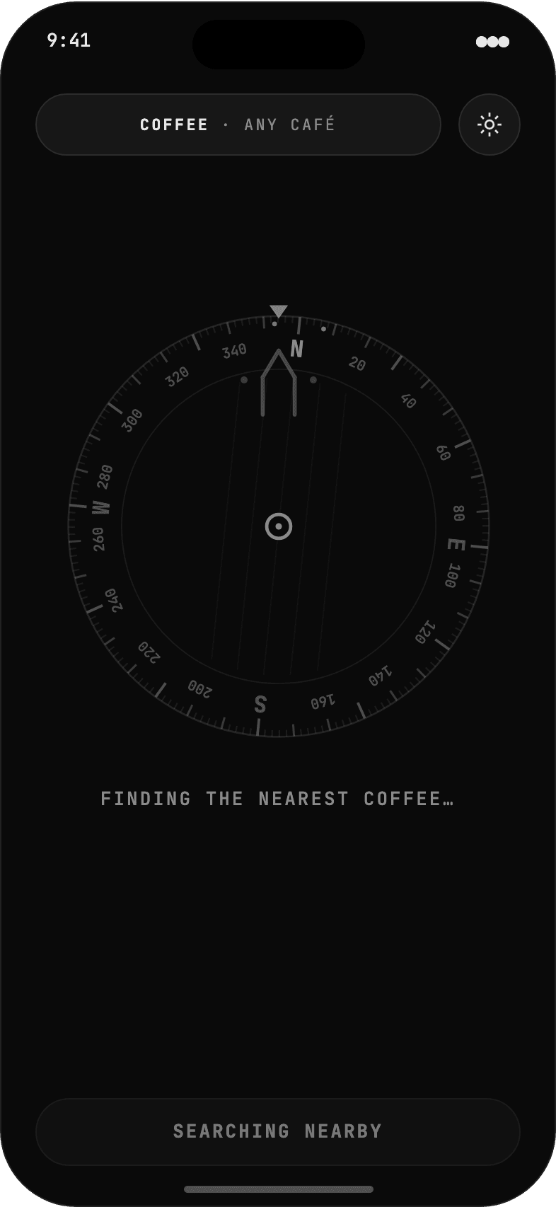
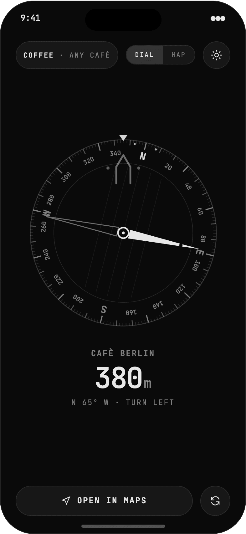
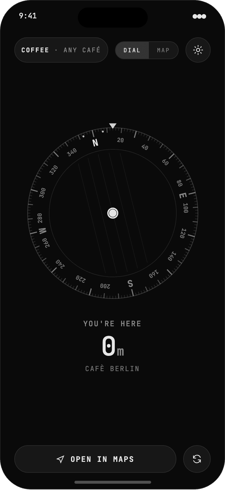
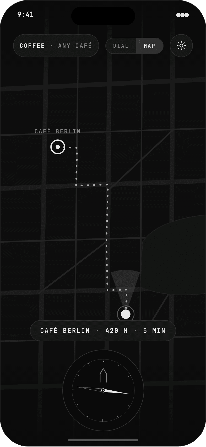
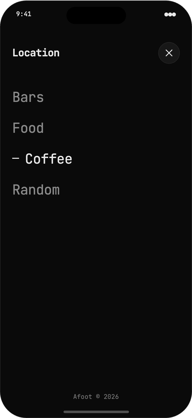
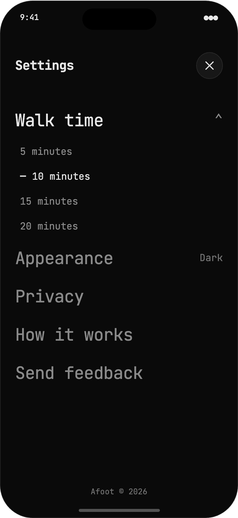
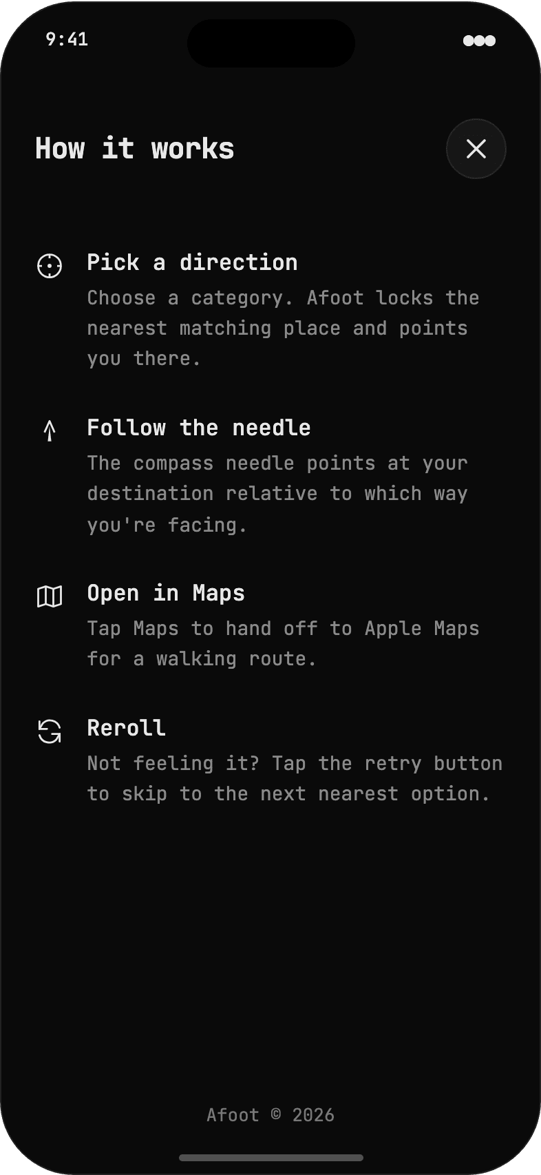
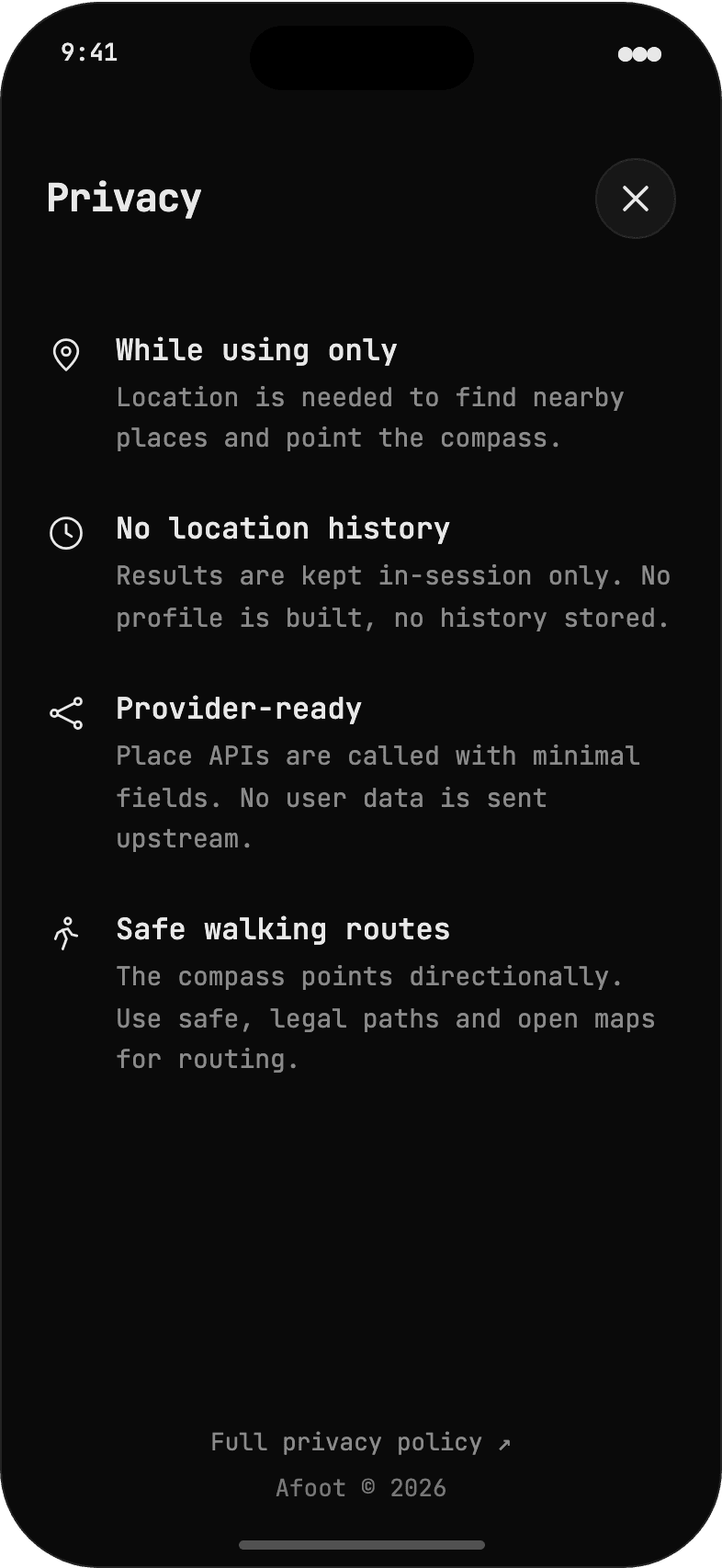
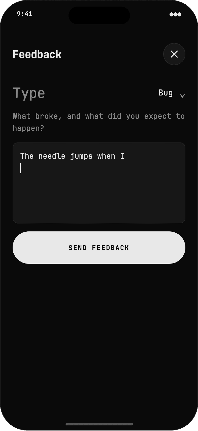
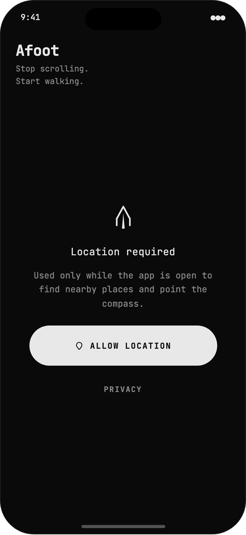
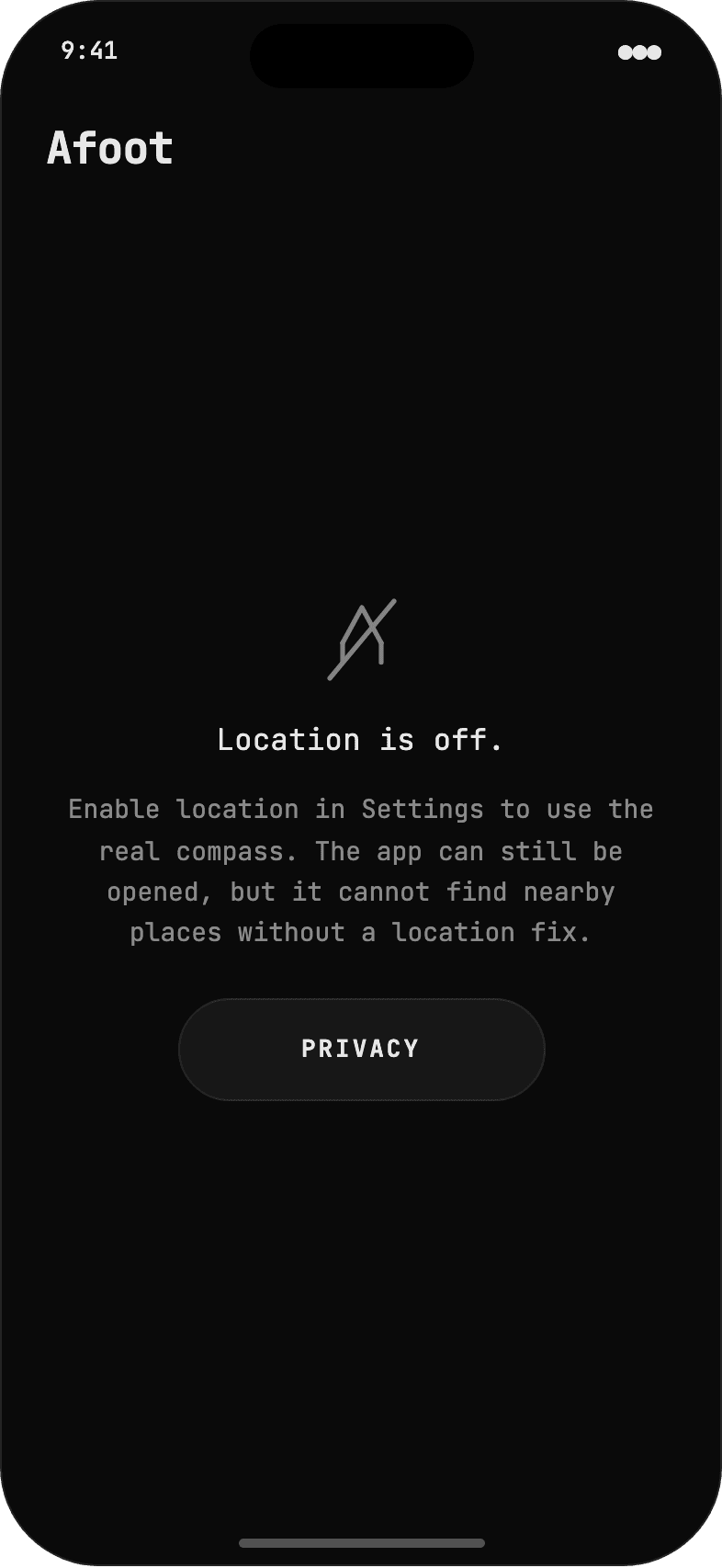
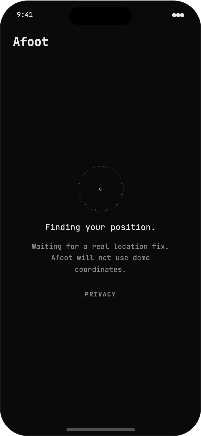
Flat monochrome, no gradients, no shadows, opacity as the only depth channel. IA and copy preserved from the SwiftUI views; the visual layer is the redesign.
A digital needle that snaps to its target looks cheap, and one that drifts looks broken. The needle uses a critically damped spring that swings from its old angle to the new one and settles without overshoot. On a reroll it launches from wherever it currently sits, so the motion always reads as mechanical rather than as a value being reassigned.
The bezel and the gate are tuned against jitter, not just animated. A 0.5 degree deadband absorbs the creep from heading noise, and a 10 degree enter, 14 degree exit hysteresis gate decides when you are aligned. That gap is deliberate. It means a confident lock instead of a value flickering on and off at the boundary. All of this lives in a pure CompassMath module: the bearing and heading functions are read every frame and mutate nothing, which is exactly what keeps the animation stable under rapid turns and lets the math be unit-tested on its own.
04 / Arrived state
Destination reached
Design decisions
The hub fills, nothing else
Needle and gate fade out, the jewel hub fills solid. No checkmark. The instrument resolving is the success state, and the words carry the rest.
Haptic confirmation
Arrival fires a success notification haptic. The visual and the feel land together.
No auto-advance
The app waits. The user decides whether to open Maps, pick a new direction, or just close it.
Locking the nearest match is harder than nearest-by-distance. Apple MapKit often returns places with no opening hours, so a naive open-now filter leaves you staring at "nothing nearby." The selector runs two passes: confirmed-open places first, and if none qualify it falls back to places with unknown hours, excluding only the ones confirmed closed.
Then there is the question of what happens when you do not want the place it picked. Reroll. The rejected place is excluded from the next search for the rest of the session. Walk up to somewhere, decide against it, and tap again? An 80 metre proximity radius excludes it automatically, so the app will not re-lock the spot you just left. The exclusions clear when you change category, because that resets intent. One real bug taught me to bound this: random mode once pointed at a result 8,827 km away. The fix was a hard max-distance guard, and it is covered by a test so it stays fixed.
05 / Place exclusion system
Session exclusion register
Places are excluded when rerolled or when user arrives within 80m. Clears on category change.
Click to toggle exclusion state
Design decisions
Exclusion, not history
The app never stores where you've been. It only tracks what not to show again this session, a functional constraint, not surveillance.
Two triggers
Reroll (explicit rejection) and proximity arrival (implicit: you checked it out and kept walking).
Session-scoped
Exclusions clear when you change category. Switching from Bars to Coffee means fresh candidates. Past rejections do not carry over.
Afoot launched on Google Places for coverage, then moved to Apple MapKit. Two reasons. Apple's MKLocalSearch is free for native iOS apps, which a one-time-purchase app needs, and its results come back as MKMapItem objects with full place identity. Call openInMaps() and Apple Maps opens to the named business card, not a dropped pin.
The handoff also got simpler. iOS lets people set a default navigation app system-wide, so the old Apple Maps / Google Maps / Waze picker sheet was deleted. One tap opens whichever app the user already prefers. Because MapKit calls still have a real cost at scale, results are cached by category, open-now, radius, and a 500 metre geofence cell with a five minute freshness window. Walk around inside the same cell and you reuse the cache instead of paying for another round trip. A PlacesProviding protocol keeps all of this behind one seam, so swapping providers never touched a view.
06 / Maps handoff
Handoff routing
MKMapItem.openInMaps()
iOS routes via OS
iOS routes via OS
Click a row to expand
Why one button, three apps
No picker sheet
Previous version showed Apple Maps / Google Maps / Waze as a confirmation dialog. Removed. iOS 17+ lets users set a default navigation app system-wide. One tap, their preferred app.
Business card routing
MKMapItem from a MapKit search carries full POI identity. openInMaps() opens to the named business card, not a dropped pin, in Apple Maps and in apps that support the handoff.
Zero API cost
Switching from Google Places to Apple MapKit eliminated per-request costs while improving the Apple Maps handoff. Google needed a Place ID for business card routing; Apple gives it for free.
Location is the whole product, so the permission ask is the brand promise, not a system afterthought. The gate-and-lance mark fronts a single screen with one action and an inline privacy link, so you can read what you are agreeing to before you tap. The request is When In Use only. No background tracking, no Always mode, no accounts, no location history written anywhere.
The copy is concrete and stays away from anything that reads like a routing or driving aid, because the compass is directional, not turn-by-turn. To keep power and request frequency low the location manager runs at ten-metre accuracy with an eight-metre distance filter and a one-degree heading filter, with the heading itself smoothed before it reaches the dial.
01 / Permission screen
Location request
Design decisions
No onboarding
One screen, one action. No carousel explaining features. The needle explains itself.
Privacy link inline
Users can read what they're agreeing to before tapping. Not buried in settings.
When In Use only
No "Always" mode request. The permission copy explains why: only while open.
Afoot is a native SwiftUI app for iPhone on iOS 18 and later. I submitted it to the App Store as a one-time purchase with no account or in-app purchases. The code separates location, session state, place search and caching, compass math, and the SwiftUI views.
Ten unit-test suites cover the parts most likely to fail outdoors: bearing math at the 0 and 360 degree boundary, reroll exclusions, the two-pass open-status fallback, geofence cache freshness, and walking-time estimates. I designed the product, wrote the app and tests, and submitted it with Claude Code in the loop.