Handoff
Missing product model
The approved MVP arrived with little documentation and no shared structure.
I took over SmartView after its MVP, rebuilt the missing product model, and designed a responsive module system for remote data-center monitoring.
SmartView had an approved MVP, but the handoff included little documentation and no shared system for the product to grow into. The existing experience was desktop-led even though technicians needed to monitor hardware away from the data center.
Environmental, power, mechanical, electrical, alarms, and alerts each carried dense operational data. Treating each surface as a separate design would multiply the inconsistency and the development cost.
I reverse-engineered the MVP into requirements, a sitemap, a persona, and user flows before redesigning the interface. That work gave the product team one picture of the system and exposed the repeated structure beneath the individual screens.
One responsive grid, one section template, and one exception model then carried all seven surfaces. The same foundation could serve direct customers and resellers without creating a second product.
The project started in the middle. I first worked backward from the approved MVP and the available research, then moved forward through discovery, definition, structure, prototyping, and detailed visual design.
Understand a DCIM product I had not designed and recover the logic behind the approved MVP.
Identify which monitoring tasks needed one shared structure and where the structure had to change.
Make remote operational status readable from desktop through mobile without hiding exceptions.
Handoff
The approved MVP arrived with little documentation and no shared structure.
Operator
Technicians needed account, facility, subsystem, and asset context at every step.
Information
Healthy states had to recede while alarms, alerts, and trends stayed visible.
Delivery
The first monitoring pattern had to reduce the cost of the next six.
Equinix framed enterprise and enabled cloud service providers as an opportunity above $20 billion. The archived competitor review showed a narrow window: several providers had internal tools, while customer-facing DCIM products were planned, limited, or power-only.
Mapping the requirements against the MVP let me learn the DCIM domain while recovering the product logic. It also gave the producer, product manager, and engineering team a shared reference for what existed and what remained.
The approved MVP had no sitemap in the handoff. I reconstructed one from the product so the team could see the account, dashboard, reporting, notification, and monitoring branches as one system.
Prior research described an operator responsible for uptime across accounts and locations. The technician needed real-time data, remote access, responsive support, automation, and a way to find the affected asset quickly.
Healthy status could stay quiet. Alarms, alerts, asset context, and trend history needed to remain visible as the technician moved through the system.
How might we make the exception visible without turning every healthy state into noise?
How might we let a technician move from facility status to one affected asset without losing context?
How might we design the first monitoring section so the next six cost less to design and build?
The alternatives below come from choices documented in the project archive. Where the record does not preserve a formal option set, the case states only the opposing path that the source directly describes.
This redraw transcribes the named destinations in the original sitemap and groups the repeated monitoring sections under one facility branch. It is a portfolio redraw, not an original 2016 deliverable.
The archived use-case framework preserves the major transitions but not every branch or validation state. These diagrams rebuild three complete paths and label them as reconstructions.
Move from overview to the affected asset without losing location context.
ContinueFault: continue to subsystem and asset
RecoverNormal: return to overview
Carry a fault from its persistent signal to enough evidence to act.
ContinueEnough context: resolve or escalate
RecoverNeed more: open trend, then return
Turn an asset condition into a validated, routed notification.
ContinueValid: save and confirm
RecoverInvalid: preserve values and identify fields
Seven screens form the operating model: one overview, four monitoring surfaces, and two exception surfaces. The map shows the repeated navigation and the transitions between status, asset detail, alarms, and alerts.
Monitor
Respond
Every route preserves account and facility context, then returns to the dashboard.
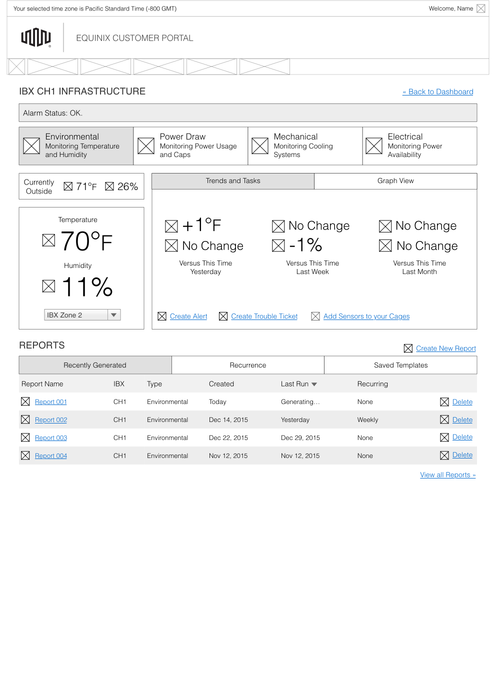
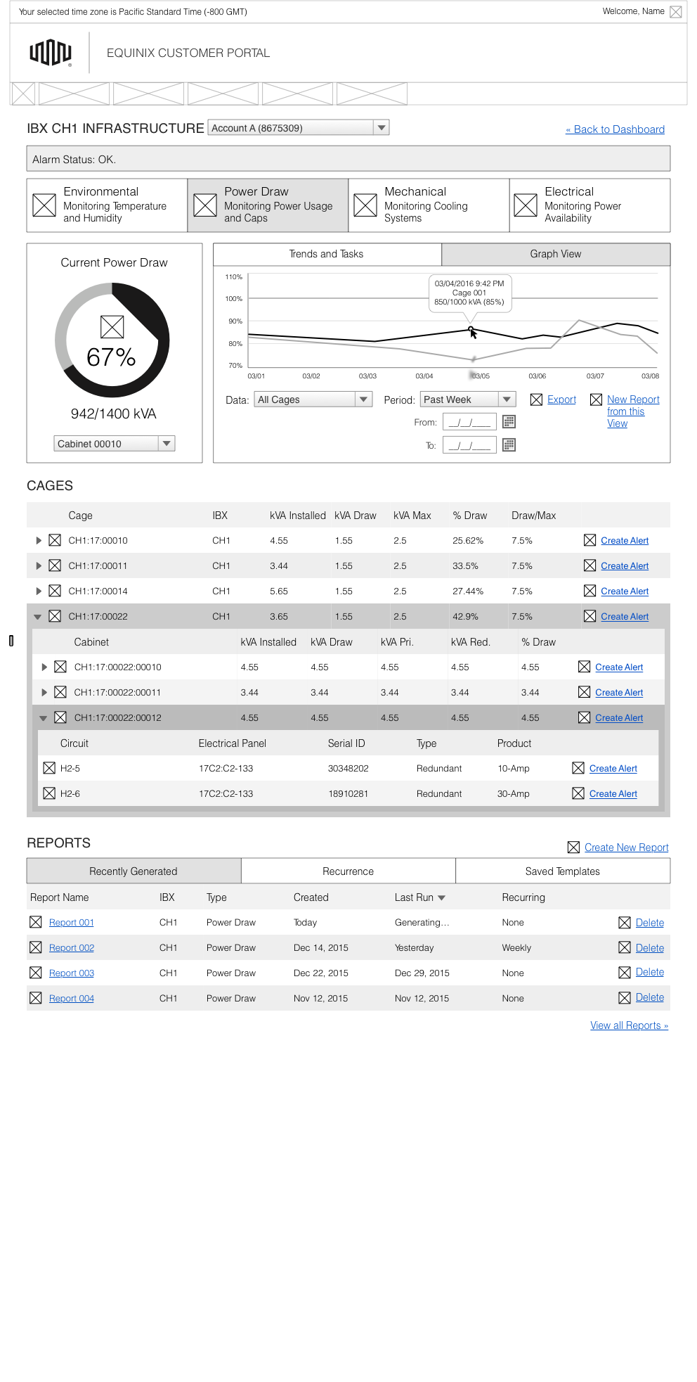
These low-fidelity frames isolate the shared layout decisions from the detailed visual design. They are reconstructed for this case from the surviving screens.
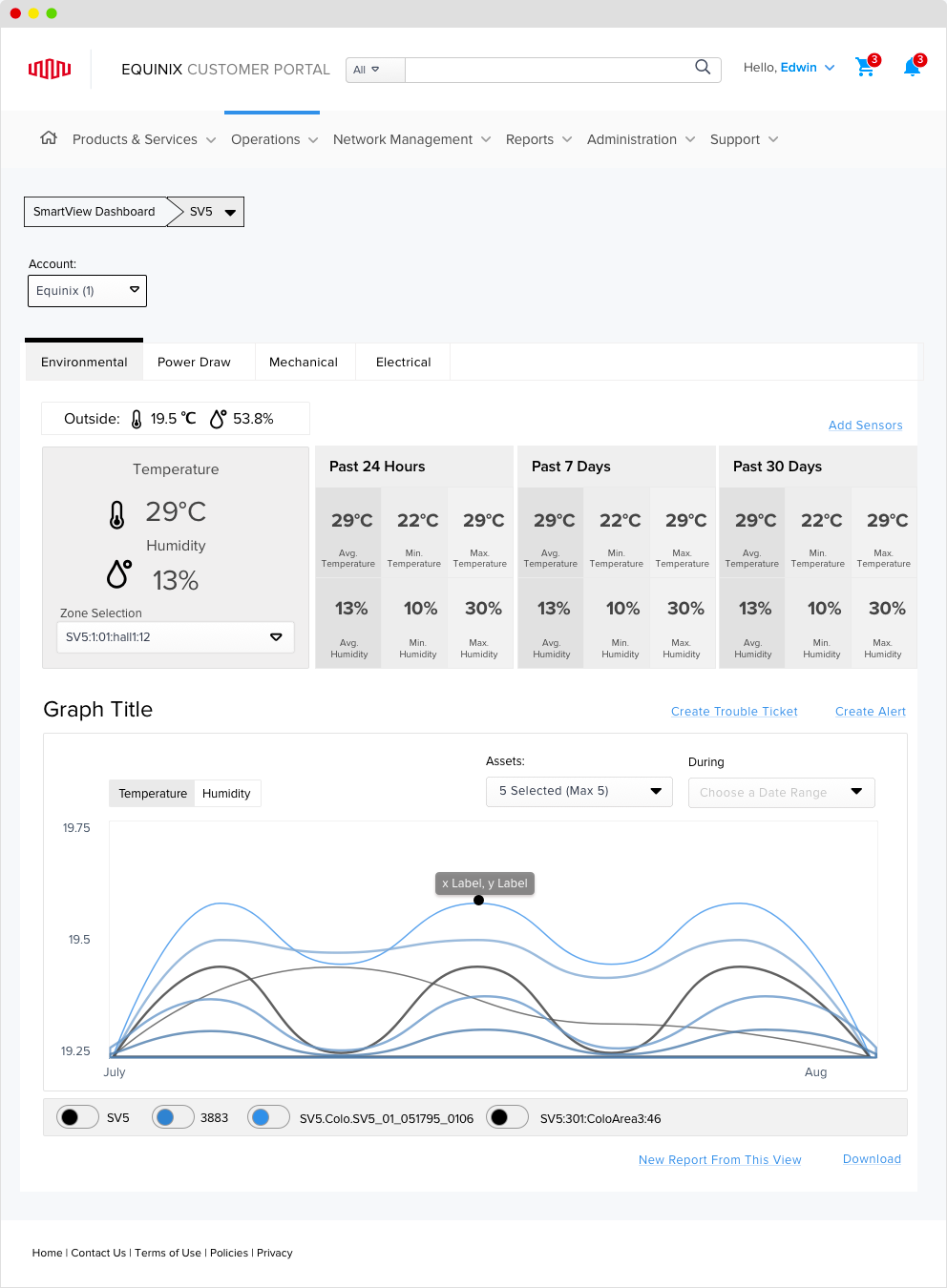
Environmental, power, mechanical, and electrical answer the same operational questions: what is happening now, how it has changed, and which asset needs attention. The interface keeps that sequence stable while letting each subsystem carry its own measurements.
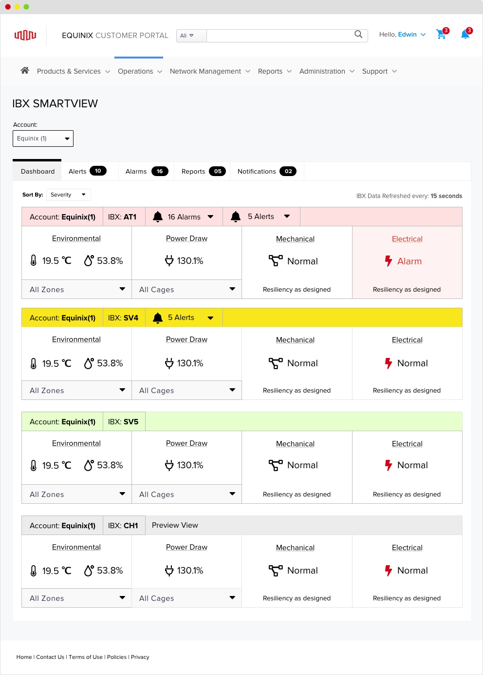
The dashboard became an operational overview rather than another report. The redesign removed the right rail, moved global actions into the top frame, and made the four facility states visible together.
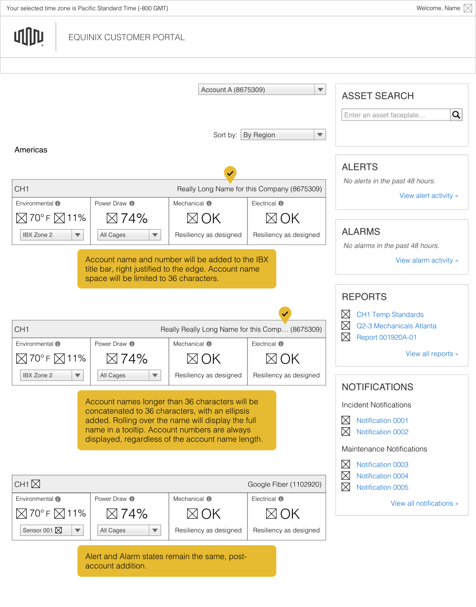
MVP feedback showed that customers wanted live temperature and humidity trends up front. The redesign moved trends into the primary scan, kept the detailed sensor table underneath, and removed a reports section that duplicated the same answer.
Power Draw reused the first section template for primary, redundant, contracted, and total consumption at cage, cabinet, asset, and circuit levels. This was the proof that the system could carry different measurements without creating another navigation or data pattern.
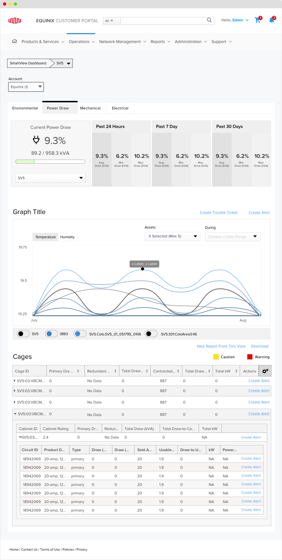
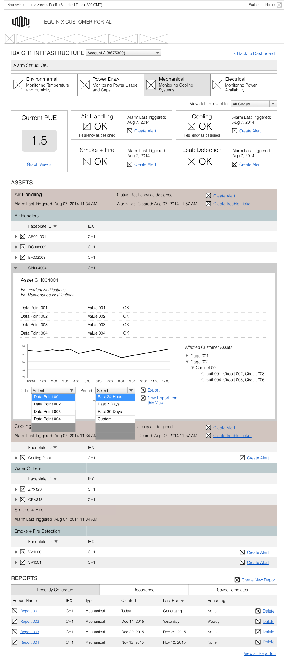
Mechanical exposed the limit of strict consistency. Customer feedback identified the long asset list as the problem, so I used a directory tree instead of forcing the shared grid into the wrong job. Electrical retained the shared template and added an asset map for tracing connections.
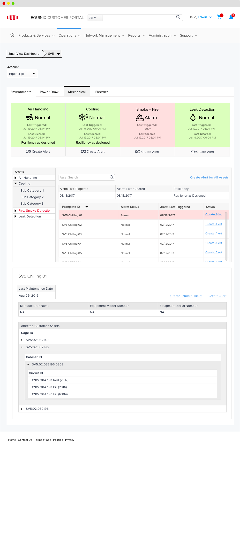
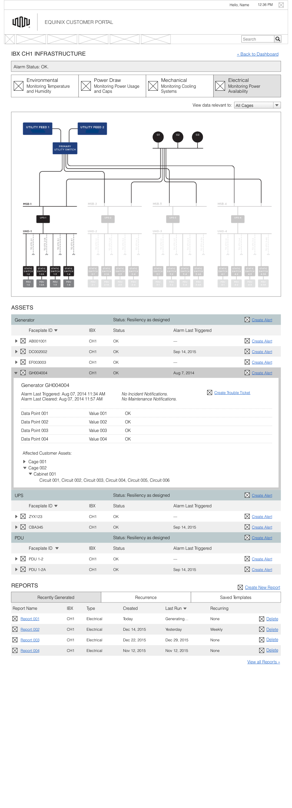
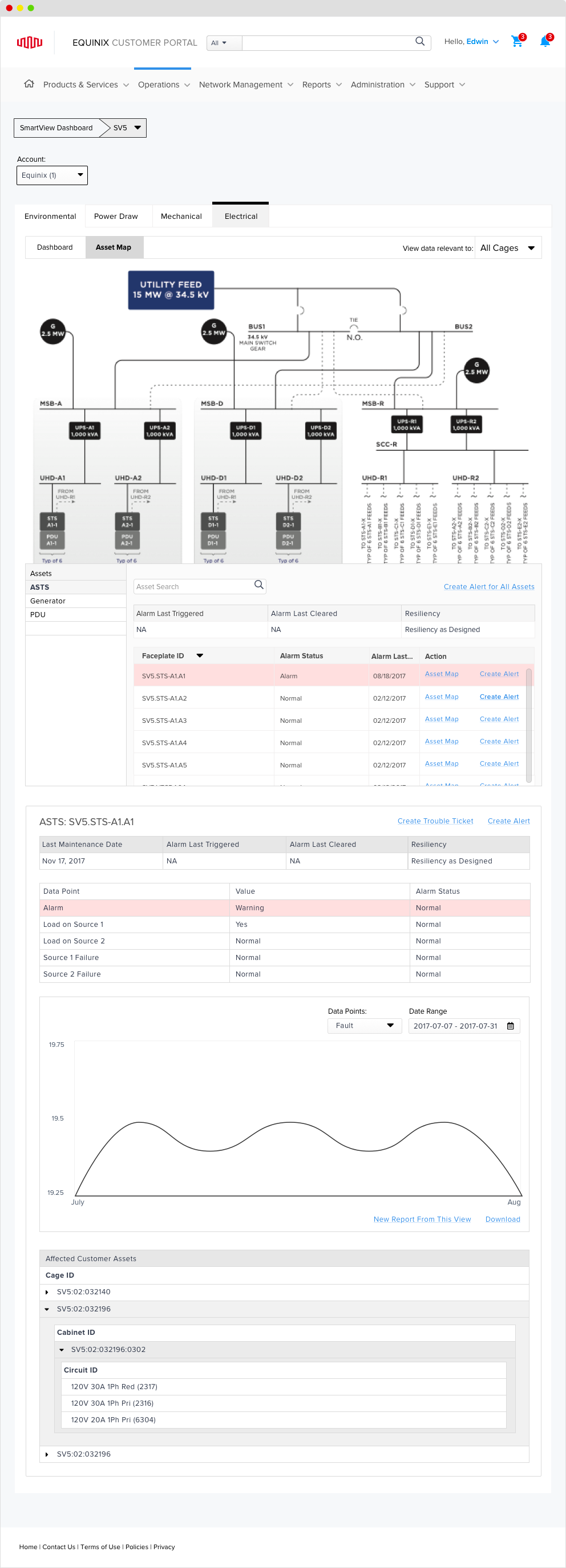
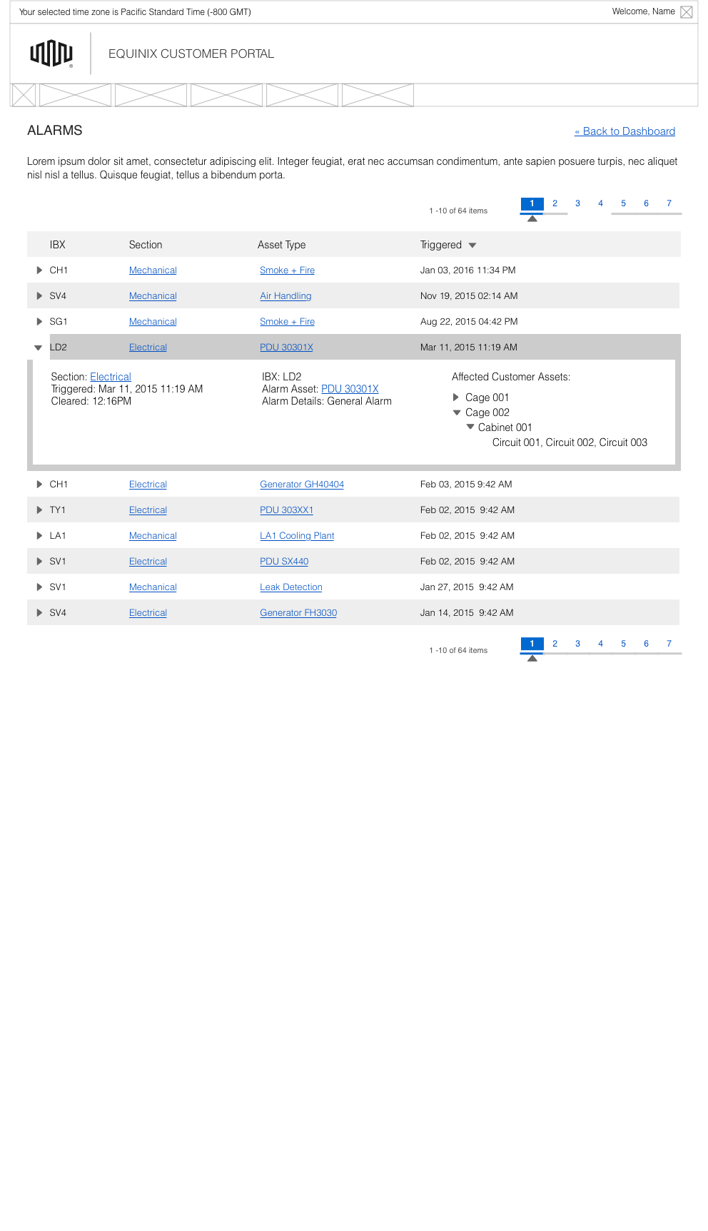
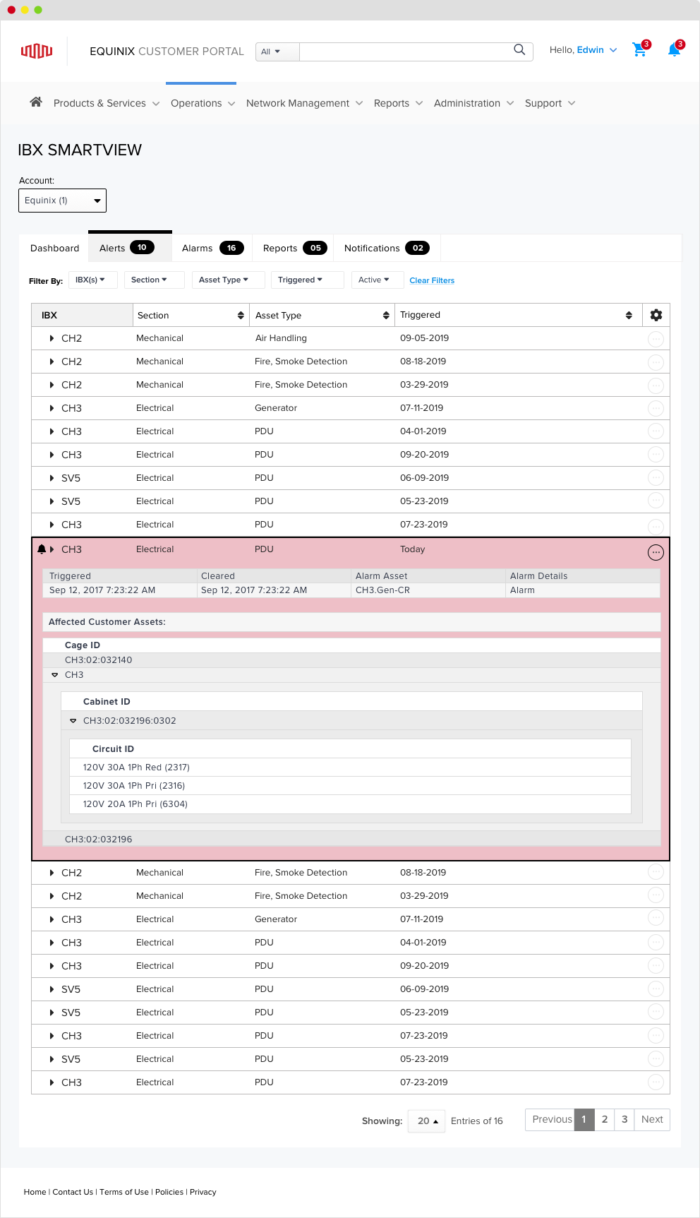
Alarms are system faults; alerts are thresholds configured by users. The redesign kept that distinction explicit, added deeper filtering, and used persistent banners so a technician could monitor exceptions across IBXs without leaving the current task.
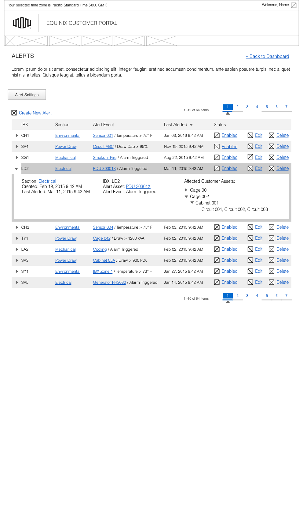
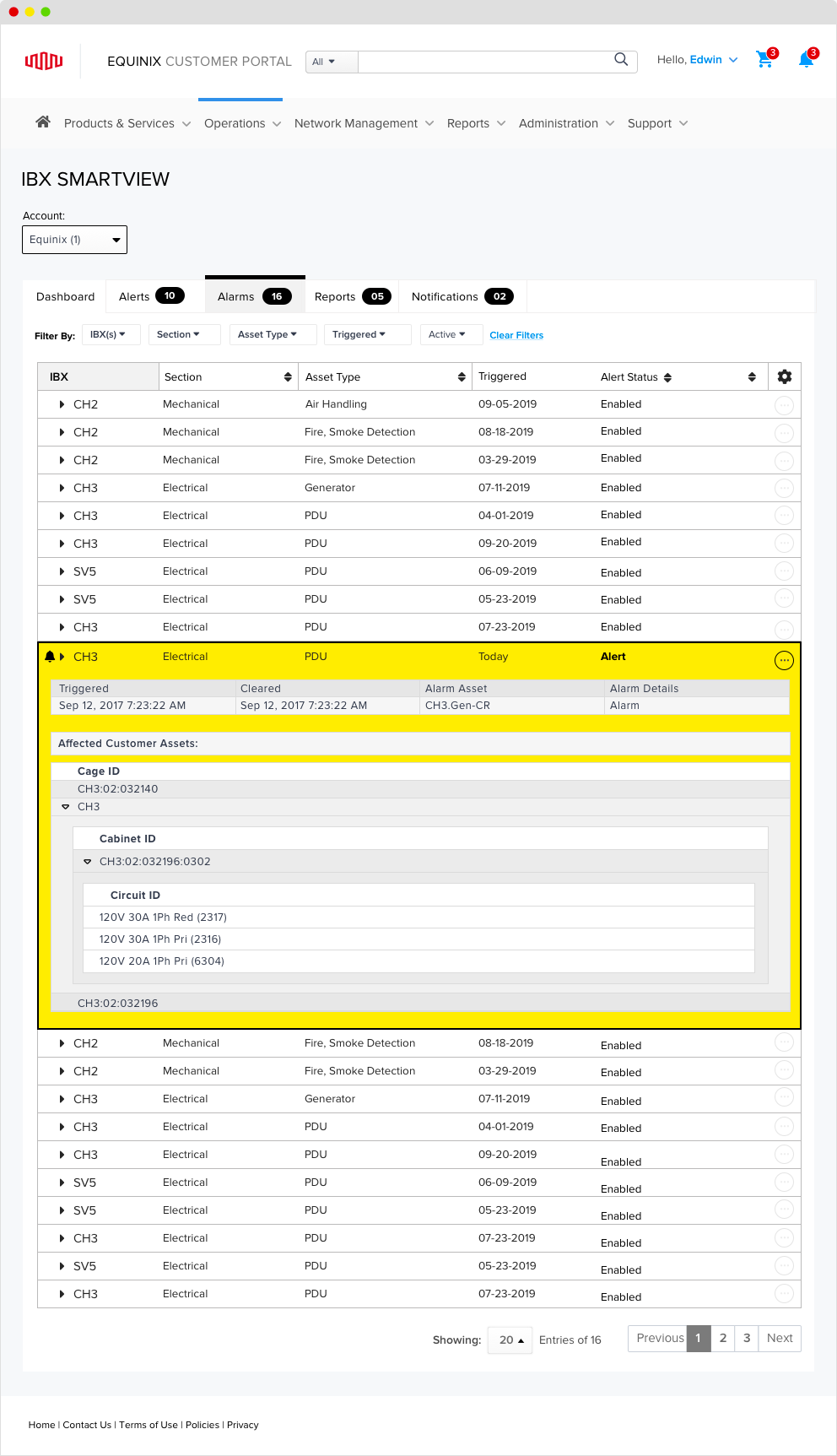
This interactive recreation is built from the archived screens. Open a facility from the dashboard, move across environmental, power, mechanical, and electrical, then inspect alarms and alerts from the global navigation.
Account:
The archived framework supports four columns from 360 pixels, eight on portrait tablet, twelve on landscape tablet, and sixteen on desktop.
The project record reports that the grid designed here replaced the previous grids across the Equinix product line. The archive does not preserve adoption counts.
360 to 599 px
600 to 799 px
800 to 1279 px
1280 and above px
I handed the project off during detailed visual design. I do not claim final implementation ownership, usage growth, or launch metrics. The archive supports the design decisions, screen set, and reported product-line adoption of the grid.