Pogo carried 21 years of content and more than 50 games. I led the redesign and cut the site in half.
Pogo.com is a free gaming site with more than 50 casual games from brands such as Hasbro and PopCap. By 2018, two decades of added pages and game variations had made it difficult to navigate. EA brought me in to lead the redesign. I set the direction, tested it with 3,400 players, and reduced the first release to less than half the original footprint.
- Client
- EA Games, Pogo.com
- Role
- Lead UX and acting Product Manager
- Team
- Researcher, 2 engineers, 3 PMs
- Timeline
- Nov 2018 to Mar 2019, launched globally Mar 2020
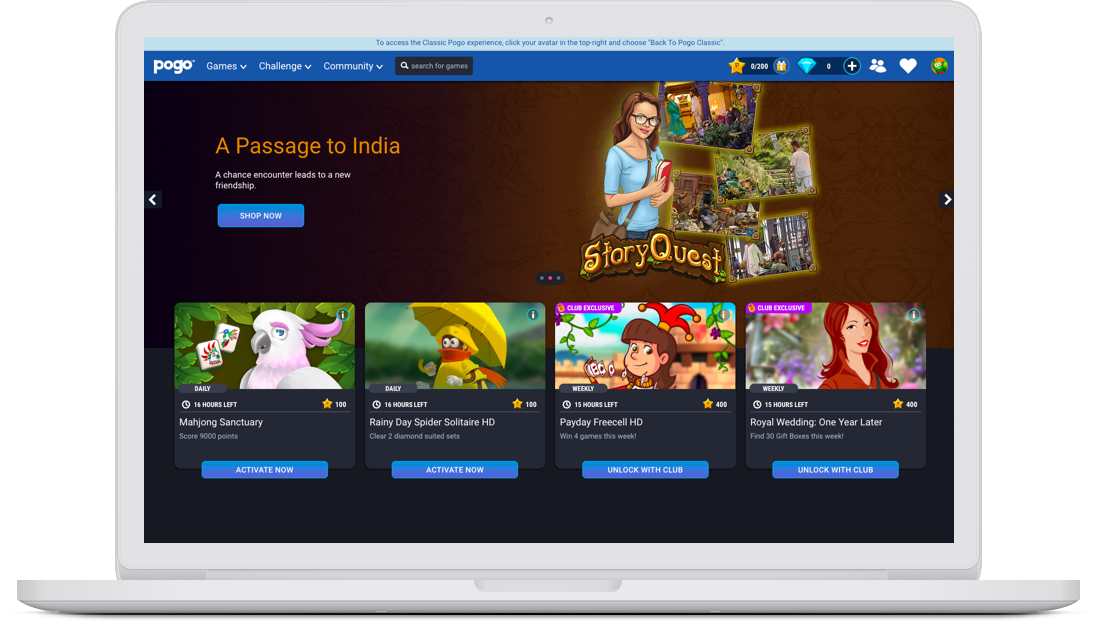
Twenty-one years of content had outgrown the structure.
Pogo added Flash games, HTML games, mobile support, and content variations over two decades without a stable information architecture. EA needed a responsive site that made sense without driving away the players who already knew it.
- 01Two decades of accreted content and game variations, with no information architecture holding it together.
- 02Navigation users openly hated: too many levels, too many links, most of which they never touched.
- 03Content tiles players could not read: they could not tell what game an image represented.
- 04An established, older, less tech-savvy audience I could not afford to alienate with a redesign.
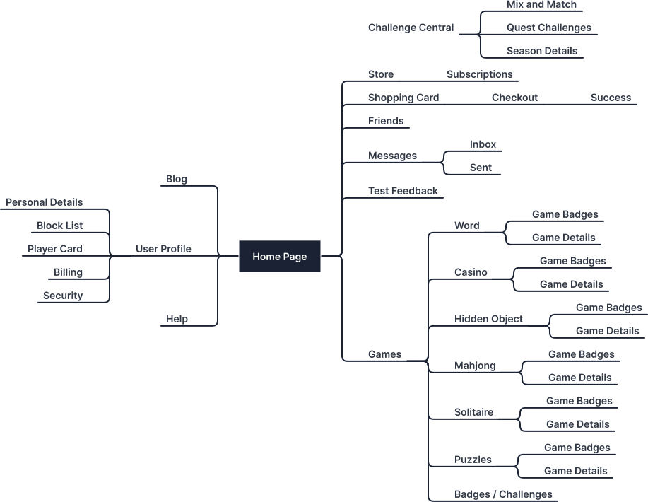
Three moves set the redesign.
I mapped the site, then checked the findings with 3,400 players.
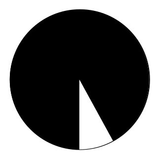
The inherited structure was built on old assumptions. A full audit made the duplication and dead ends visible. I checked those findings through a 3,400-subscriber survey based on EA's Global Segmentation Study, then ran seven to ten video interviews about devices, flows, and motivation. The research produced five personas. Curious Solver represented 56%.

I reduced the first release and split the work into phases.
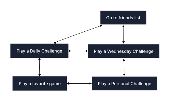
The team could not rebuild twenty-one years of pages at once. Players followed a simple loop: find a challenge, play it, then return to a favorite game. Designing around that loop let us remove low-value pages and bring useful content forward. The first release used less than half the original footprint. A phased launch gave the small team a manageable build and a clear next step.
I used one grid and one challenge card across the site.
Player research supplied the card hierarchy. The old design buried challenges. The new card carried the six details players said they needed, including time remaining, progress, and reward. Larger game tiles and one shared grid then connected the home, game detail, and challenge pages.

The system carried from the home page into every key surface.
The walkthrough covers the audience, core loop, responsive foundation, and the pages rebuilt on the shared grid.
Who plays Pogo.
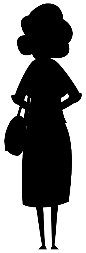
The segmentation study produced five personas. The Curious Solver leads at 56%, playing to stay mentally sharp, followed by the Steady Advancer, Reward Seeker, Imaginative Creator, and Belonger segments. Martha, 67 and retired, playing puzzle games to keep her mind sharp and stay connected, is who I designed for.
The core loop.
Working with a researcher and a PM, I mapped current user flows. The motivations were clear: how do I find a challenge, play that challenge, and get back to my favorite game? That loop drove every structural decision.
A responsive foundation.
Pogo's audience skews older and often on older devices and slower connections. Using Google Analytics I found the real screen sizes and devices in use, then built the responsive system with the dev team on Google's Material framework. No need to reinvent the wheel.
| Device form factor | Min screen size | Break points |
|---|---|---|
| Desktop PC | 1280 - 1600+ | 960, 1280, 1600 |
| Tablet landscape | 800 - 1280 | 960 |
| Tablet portrait | 600 - 800 | 600 |
| Mobile | 360 - 599 | 360 |
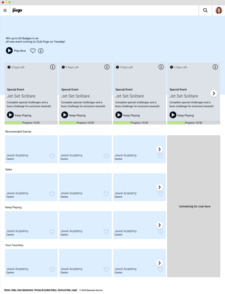
The home page.
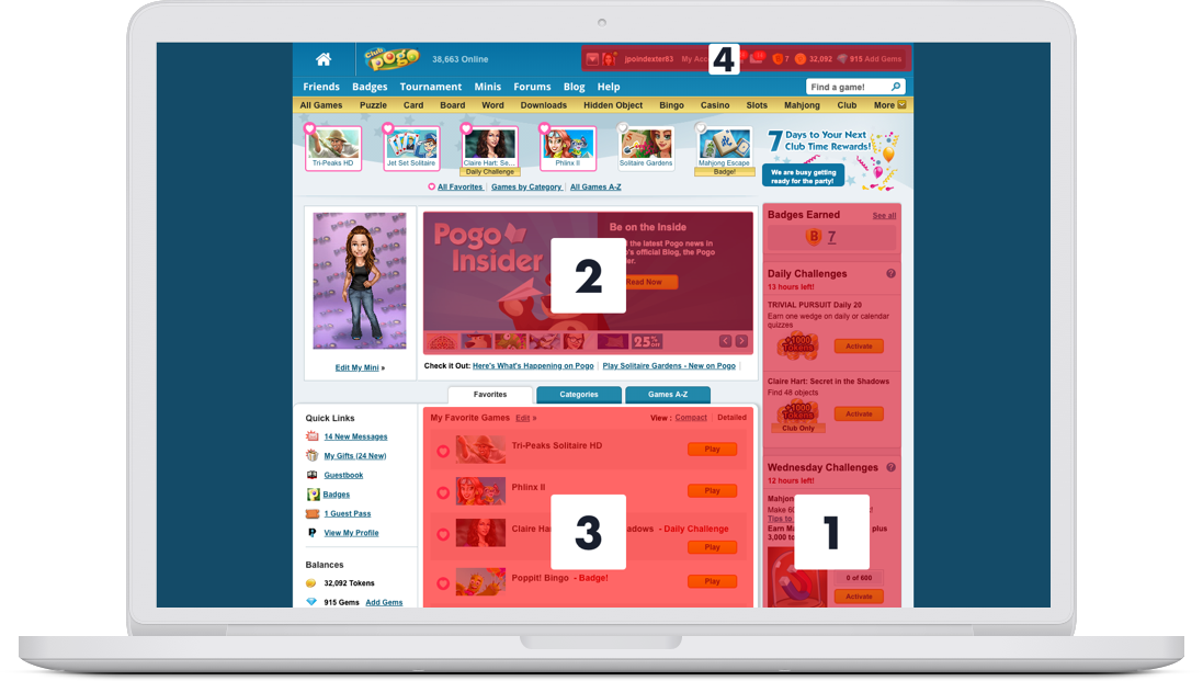
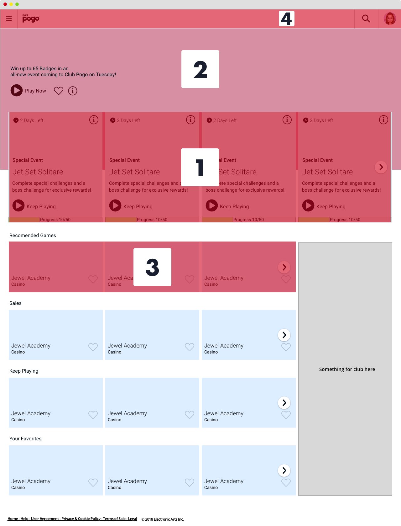
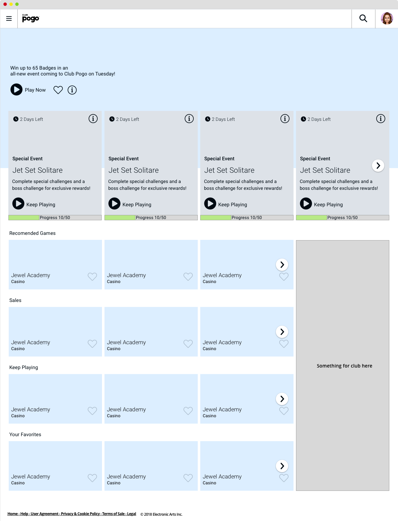
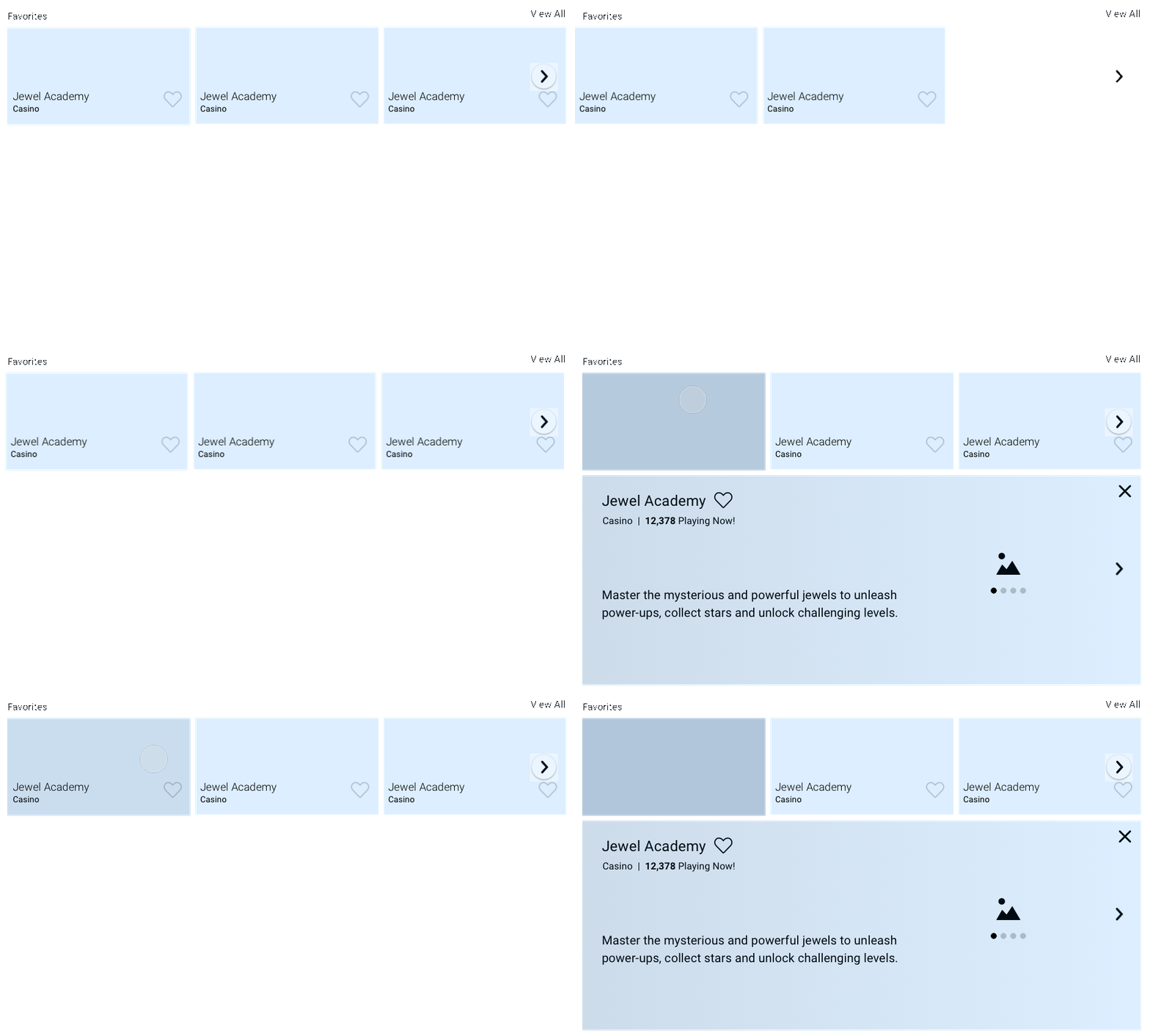
I simplified the home page around a pattern players already knew from Netflix, Hulu, and Amazon, with a new hierarchy: challenges first, then new content, then favorites, then account. It reduced the noise without asking older users to relearn how the web works.
A card for every challenge.
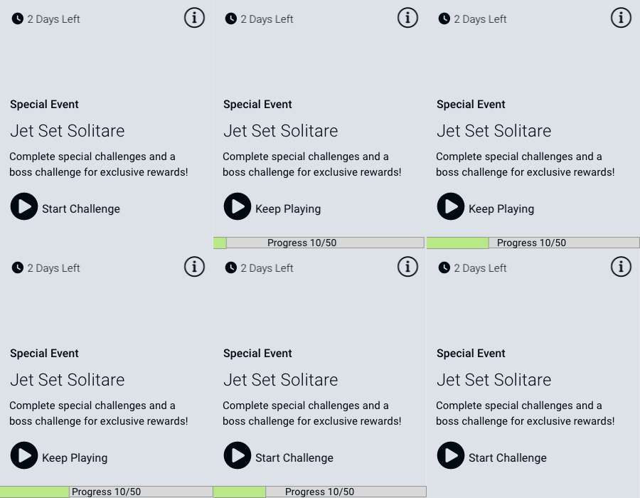
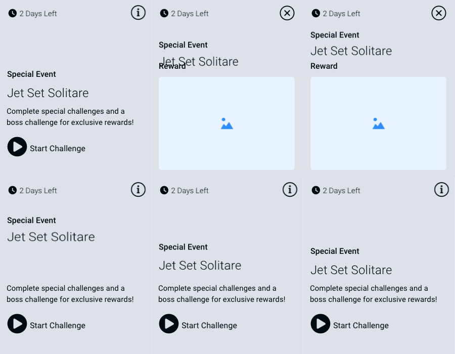
Challenges are the heart of Pogo, so I designed a card around the six data points users kept naming as important.
- 01Time remaining to complete the challenge.
- 02Event type: weekly, monthly, daily.
- 03A game image legible enough to tell what kind of game it is.
- 04A plain description: what do I have to do?
- 05Player progression.
- 06The reward for completion.
The game detail page.
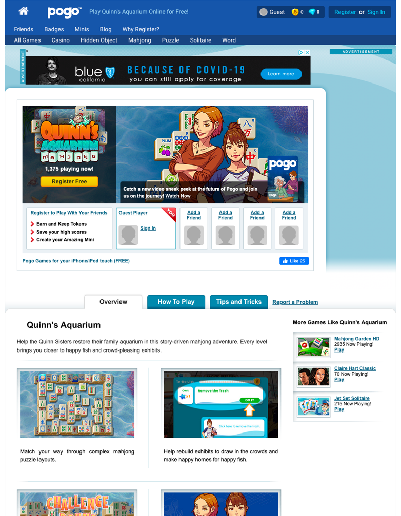
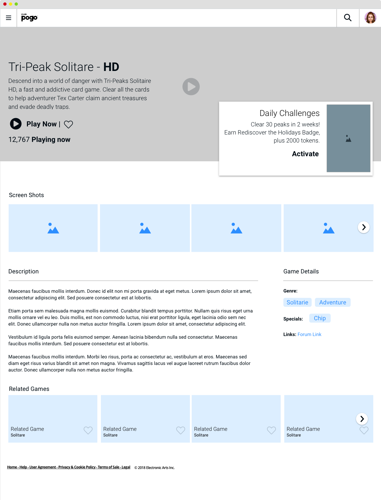
Research was blunt: players barely used this page, and only cared about the challenges available and their progress. So I stripped it to a hero and game details, then the challenges, then simplified details, screenshots, and related games. Everything users never touched came out.
Challenge central.
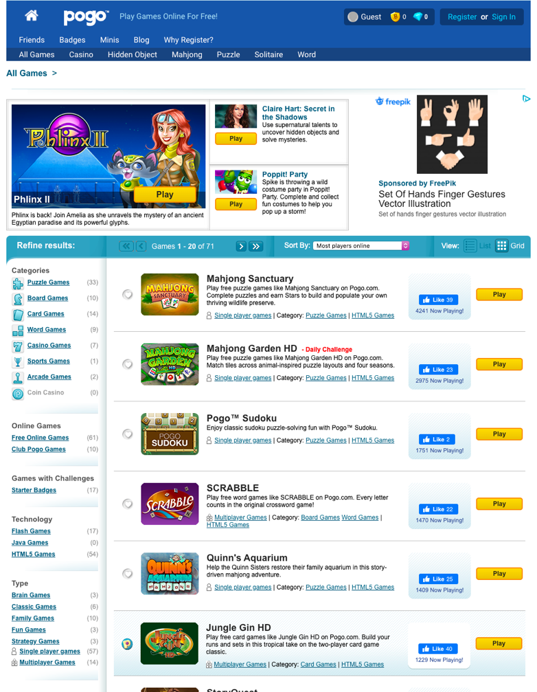
The category and challenge pages were long, verbose, and skipped: users bookmarked favorites and never came back. I rebuilt them on the same card and grid pattern as the rest of the site, so discovery could actually drive longer engagement.
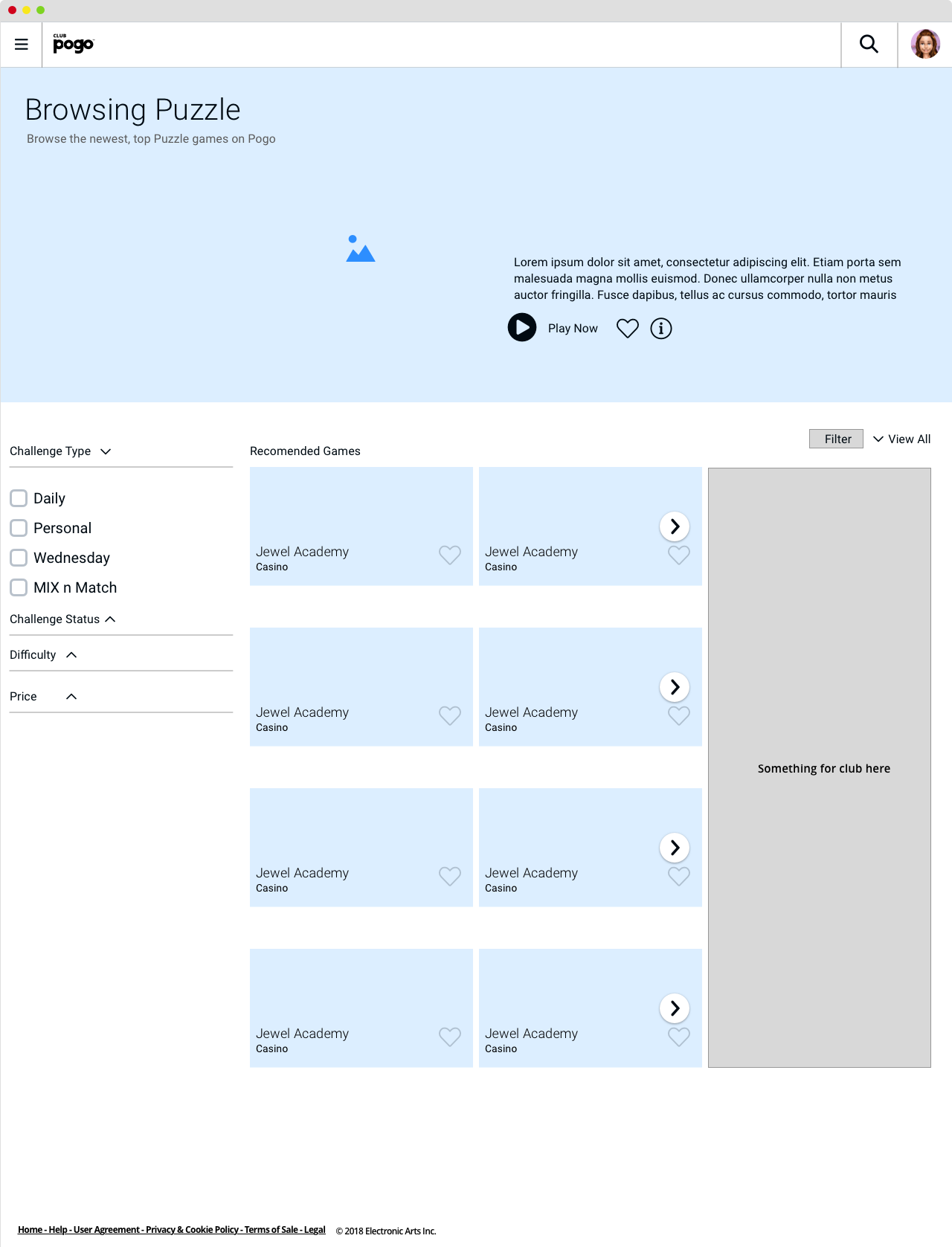
Slimmer navigation.
The clearest research signal was the navigation: too many levels, too many links, and users who did not know what most of it was. The goal was simple, slim it down and make it obvious.

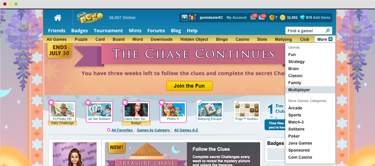
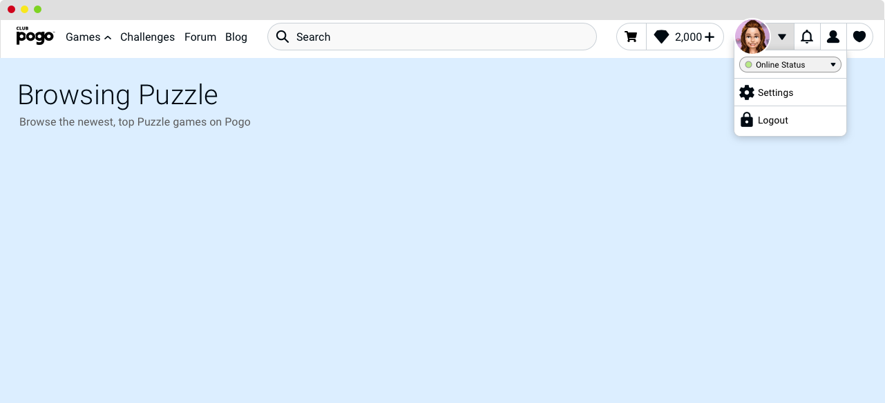
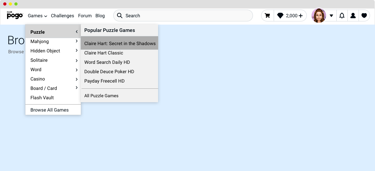
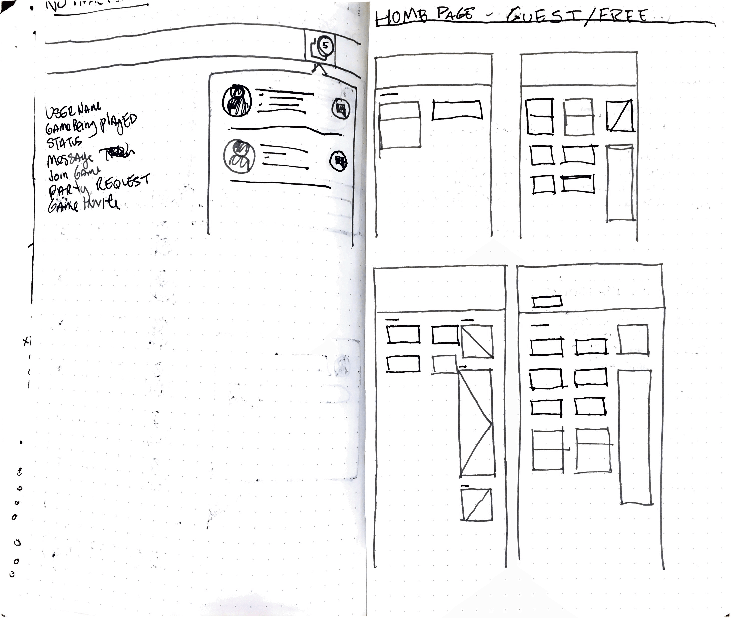
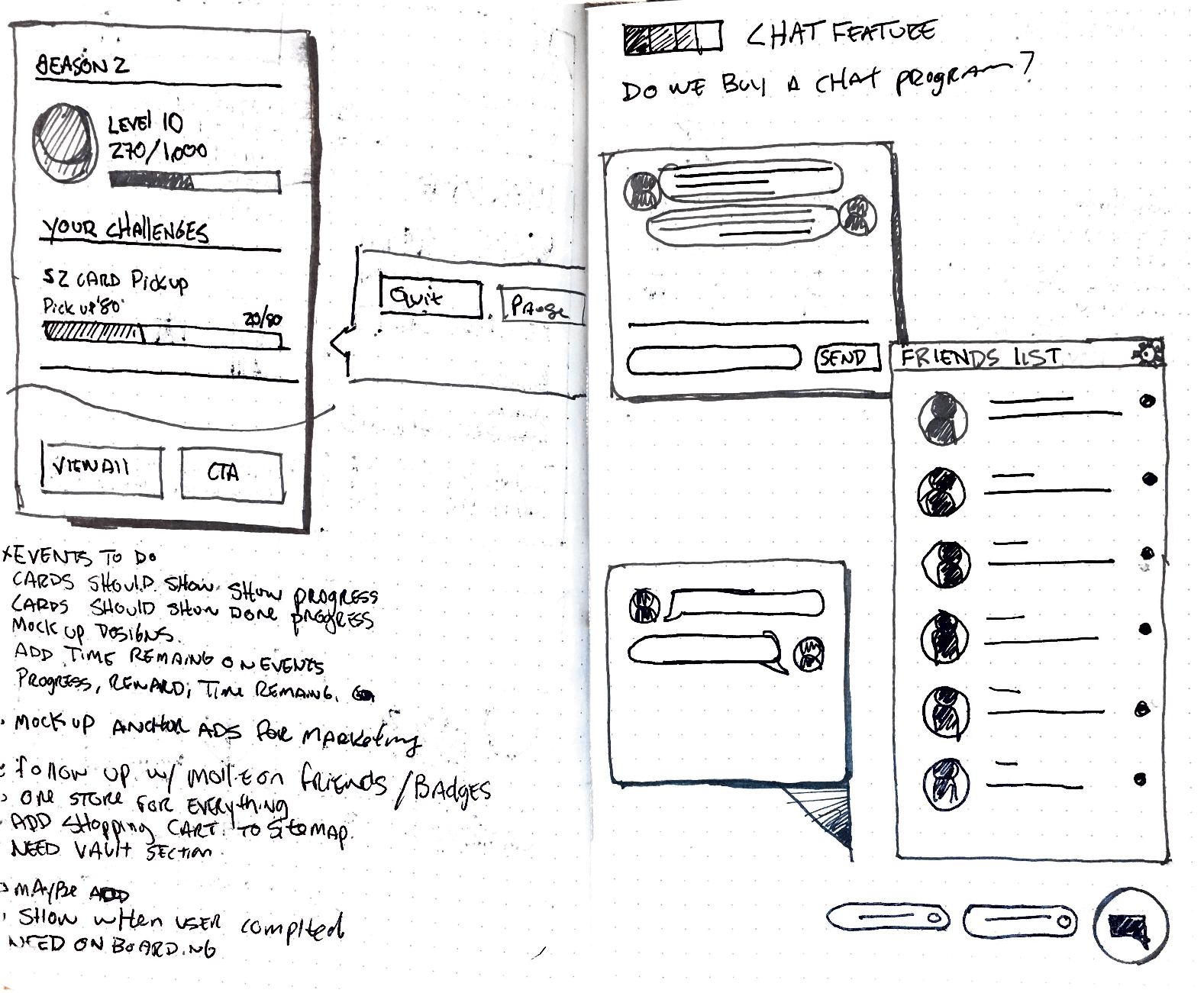
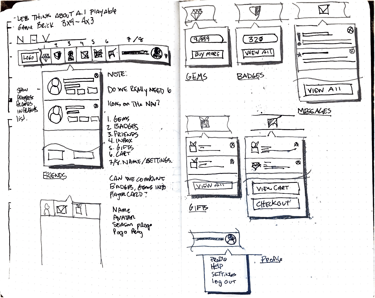
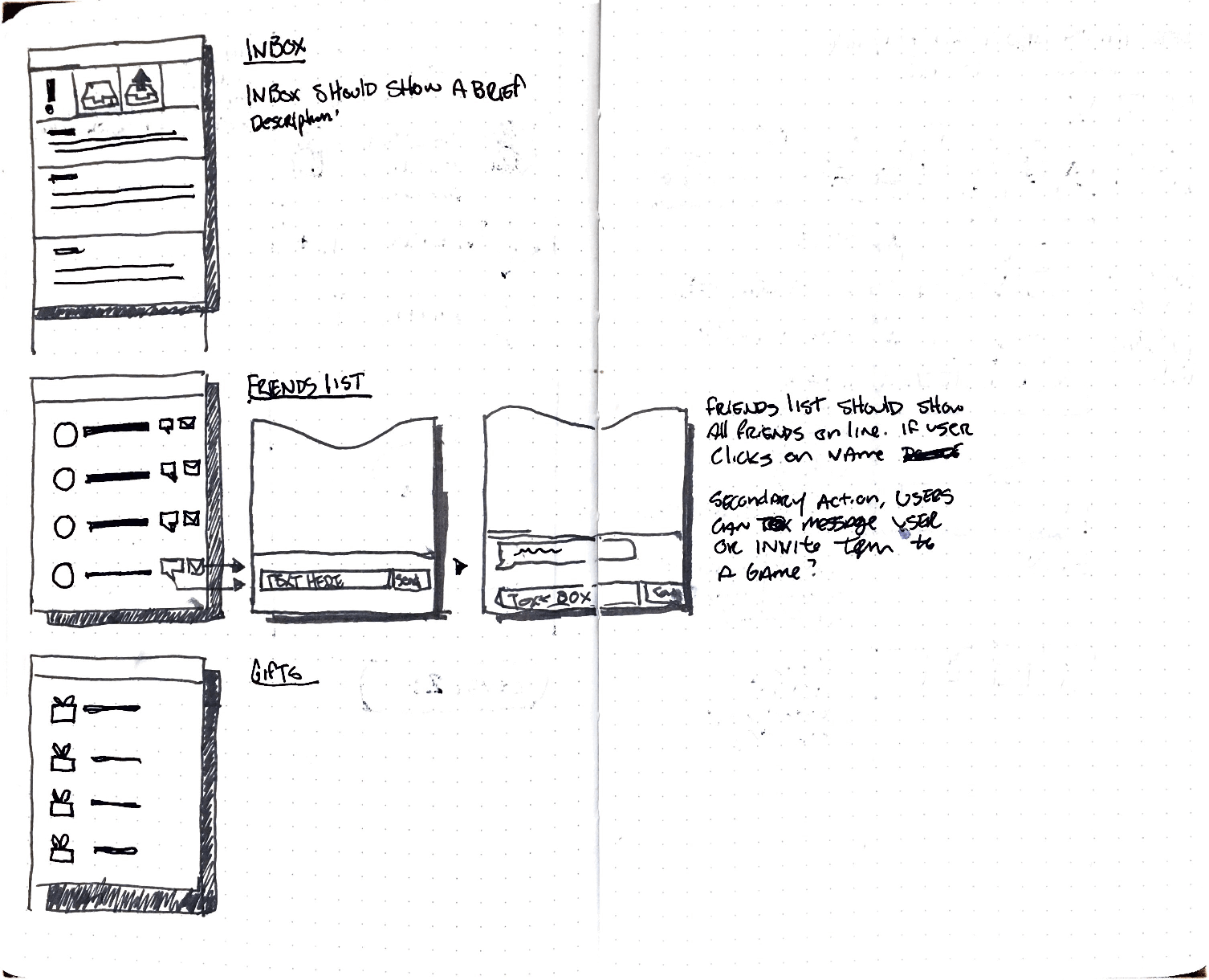
The details were worked out in rough versions first.
I used whiteboards, grid paper, and quick screen drafts to test the structure before handing work to the team. These are a few of those versions.
A 21-year-old site became less, on purpose.
The first release used less than half the original footprint, organized the main pages on one grid, and gave a small team a phased build. The project record reports a strongly positive response after launch.
Scope note: I led UX and acted as PM from November 2018 to March 2019, then handed off during detailed visual design as the build began. The site launched globally in March 2020. The footprint reduction comes from the project record. I did not measure the reported post-launch sentiment.